


Meet the only AI assistant built for data. Analyze, document, and answer any data question — fast.
 Learn more
Secoda AI already helps teams document their data, answer questions, write queries, and understand lineage all in one place. Over the last year, we’ve seen Secoda AI become one of the most reliable and accurate ways for our customers to answer common data questions.
Now, with the introduction of AI-generated charts, Secoda AI takes it a step further. Users can go from a plain-language question to a clean, shareable visualization in minutes. There’s no need to write SQL, open a visualization tool, or wait for someone else to build a report.
Whether you’re exploring a trend, validating a hypothesis, or preparing a quick update, charting brings a new level of speed to your data work, directly inside the same interface where you already search, document, monitor, and collaborate on data.
Benefits of using AI to generate charts from your data
Secoda’s AI charting is designed to be accurate, flexible, and professional. Here’s what you can expect:
- Self-service data visualization: Anyone on your team can create charts without writing SQL or switching to another tool. This makes it easy for both technical and non-technical users to explore data independently.
- Natural language prompts: Ask for a chart in plain English. For example, “Create a bar chart of weekly sign-ups by region” or “Show a line graph of revenue and profit margins over time.”
- Comprehensive chart library: Support for a wide range of charts, including bar, line, area, scatter, heatmap, and pie charts, designed for flexible data exploration.
- Always reflects current data: Charts are based on the latest data, so you can trust data is fresh without needing a manual refresh.
- Downloadable and shareable: Export charts as SVG or PNG files to easily share in Slack, Teams, email, or other platforms.
What makes Secoda charting different from traditional BI tools
Secoda AI charts aren’t meant to replace dashboards. Instead, they’re designed to fill the gap BI tools struggle to cover. We call this “the curiosity gap”. The curiosity gap is made up of questions that are important enough to stall progress, too valuable to ignore, but too costly to answer with a dedicated dashboard. This would include: answering quick questions, validating assumptions, or ad hoc data exploration without writing SQL or setting up a full report.
This feature means faster answers, less context switching, and more accessibility for everyone, not just technical users. For data leaders, it’s a way to unlock efficiency across your team. For analysts, it’s a way to accelerate your workflow. For business users, it’s a way to ask and understand without waiting.
Where Secoda fits alongside traditional BI tools:
Even with Secoda’s charting capability, you still need your BI tool for in-depth dashboards and long-term performance monitoring. But when you just want a quick chart to validate a hypothesis, share with a teammate, or support a decision in real time, Secoda meets you where you're already working.
It's not about replacing your dashboards, it's about reducing the need for ad-hoc chart requests and giving everyone faster access to insight.
Real-world use cases for AI charting in Secoda
Here are a few situations where Secoda’s AI-powered charting helps you find answers quickly and move forward with clarity.
Identifying product usage changes after a release
During a team standup, someone asks whether the new onboarding flow improved activation rates. Instead of checking multiple dashboards or waiting for an analyst to investigate, you ask Secoda:
“Show me daily activation rates before and after the April 2 release.”
In minutes, you get a clear visual trend. It’s easy to share in Slack or drop into your next product review.

Investigating data quality issues
You notice something unusual in a dashboard and want to rule out missing data. You ask:
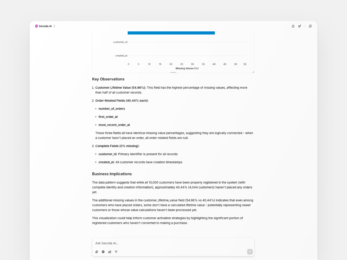
"Can you analyze my dim_customers dataset and create a visual chart showing the percentage of missing values for each critical field?"
Secoda AI returns a bar chart that quickly surfaces which fields have missing values, helping you validate data completeness and move forward with confidence.

As an added bonus, Secoda AI also provides an accompanying analysis. The screenshot below highlights how it surfaces key observations to help broaden your understanding of the chart.
Validating a hypothesis in a marketing discussion
In a brainstorming session with the growth team, someone raises the question: Are inbound or outbound efforts performing better this month? You ask:
“Compare demo signup volume from inbound and outbound week over week.”
Secoda AI analyzes the Salesforce opportunity data and returns two visualizations: one showing weekly signup volume by source, and another showing the week-over-week change.
Inbound signups clearly outperform outbound, especially with a spike in mid-April. Outbound saw a brief peak in late March but declined after. The team uses this snapshot to confirm inbound performance and adjust campaign priorities on the spot.

Understanding seasonality and long-term trends
As part of planning, you want to understand how customer engagement has changed over time. You ask:
“Line chart of average weekly logins from 2023 to now.”
Secoda AI returns a visual showing trends across months, making it easy to spot seasonal dips and long-term increases. Instead of digging through raw tables or waiting for a report, you can bring this chart straight into your planning session.

Measuring the impact of a new data policy
Your organization recently implemented stricter tagging requirements for sensitive data. A stakeholder asks whether adoption has improved. You ask:
“Show weekly counts of newly tagged PII fields since March 1.”
Secoda AI returns a bar chart showing weekly PII tagging activity throughout March. The visual makes it easy to see consistent tagging behavior each week, with a noticeable spike the week of March 15. You can now report back with confidence that the policy is gaining traction and continue tracking adoption over time.

Start visualizing your data in seconds
Secoda’s AI-generated charting turns questions into answers faster, easier, and more accessible than traditional methods.
If you're already using Secoda, try generating a chart from your next question. If you're new to Secoda, book a demo to see how it fits into your workflow.
.png)
.png)