

Meet the only AI assistant built for data. Analyze, document, and answer any data question — fast.
 Learn more
Why not be the one who drives the conversation forward? Why not be the one who walks into the meeting with the answers in hand, the report already built, the dashboard already shared?
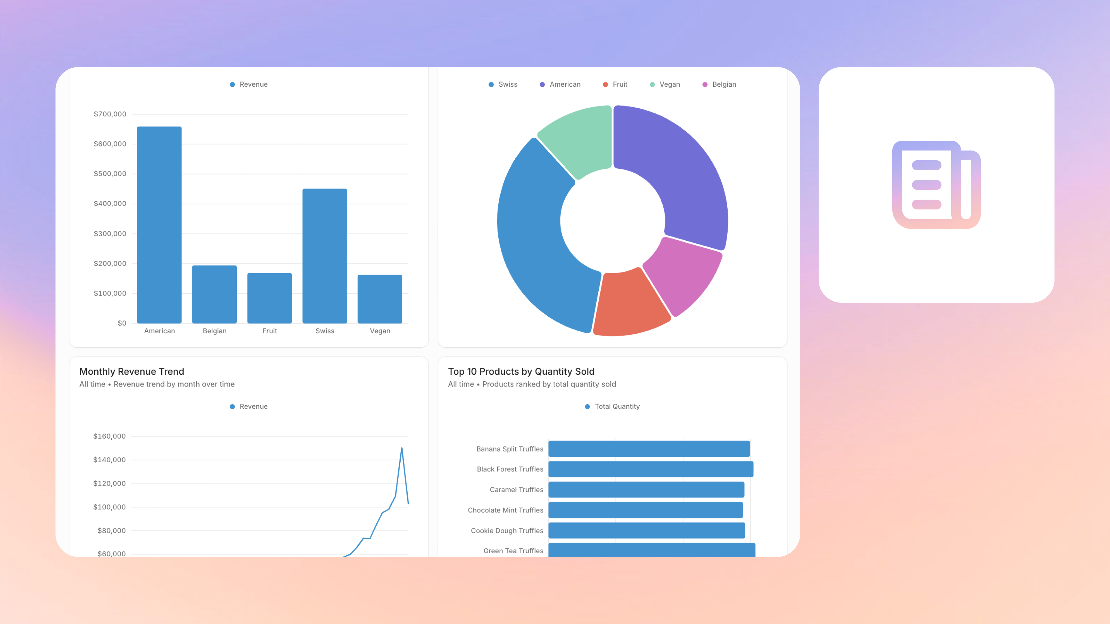
With Secoda Dashboards, anyone across the organization can generate, refine, and share live dashboards in minutes. Dashboards are built to centralize metrics, charts, and summaries in one place, whether you’re creating them manually or generating them in minutes with Secoda AI. What traditionally might have taken hours or days can now be done in a single prompt, giving teams the confidence to explore and present insights faster.
Unlike traditional dashboarding tools, Secoda Dashboards are tightly integrated with the rest of your data governance and AI workflows. That means dashboards are not only fast to create, but also transparent, editable, and governed with the same permissions and metadata management you already use across Secoda.
Why we built dashboards
Dashboards are the front door to data for most organizations, but they’ve historically been a bottleneck. Getting one built often means filing a request, waiting days, and going back and forth to get the right view. For data teams, it means drowning in ad hoc requests and spending valuable time on one-off reports. For business teams, it means waiting and sometimes missing the moment when insights are needed most.
We built Secoda Dashboards to change that. With one prompt, anyone can generate and refine a live, transparent dashboard in minutes. Business users can finally self-serve answers to their questions, while data professionals can move faster by prototyping and validating ideas without wasted cycles.
Every dashboard is built on data already connected and refreshed in Secoda. Each one automatically inherits the governance model with ownership, permissions, and metadata that you rely on elsewhere. That makes it possible to move quickly without losing trust, and gives you the confidence to share results the moment they’re needed.
Why Secoda Dashboards are a better self-serve analytics option
Anyone can do it
With Secoda AI, anyone from sales managers to executives can generate, refine, and share dashboards without writing SQL or depending on data analysts. By removing technical barriers, teams across the organization can explore data independently and find answers in real time. This shift eliminates bottlenecks and gives everyone the ability to act on insights instead of waiting in line for a report. When people closest to the business questions can create dashboards themselves, data becomes a shared language rather than a specialized skill.
You can do it extremely fast
What once took days now takes minutes. One prompt is all it takes to build a live, editable dashboard, complete with tables, charts, and queries that remain fully transparent. The process is faster, but never at the expense of accuracy or context. Teams can inspect and adjust every component, ensuring trust in what they see. That speed translates directly to better decisions made sooner, whether it’s a sales forecast, campaign result, or executive summary. With Secoda, data teams spend less time fielding requests and more time focusing on high-impact work.
It’s governed
Every dashboard automatically inherits Secoda’s governance model, including ownership, permissions, and metadata. Each one connects directly to live data, ensuring every metric reflects the latest information. That built-in governance means dashboards are accurate, auditable, and secure by default. Instead of worrying about who has access or whether definitions are consistent, teams can trust that what they share aligns with organizational standards. Governance makes self-serve analytics sustainable, so you can scale access to insights without sacrificing control or compliance.

What makes Secoda Dashboards different
Prompt to full dashboard in minutes
Traditionally, creating a new dashboard meant filing a request and waiting, or if you were the data team, spending days pulling the right metrics and manually assembling the report. With Secoda, one prompt generates a live dashboard in minutes, including charts, tables, and metrics ready to refine or share.
Transparent and explainable
In most tools, only technical users can see the queries or logic behind a chart, leaving end users in the dark. Secoda makes every visualization explainable: anyone can toggle between chart, SQL, and raw data, with the reasoning steps visible for full clarity.
Fresh by default
Traditional dashboards are often stale, updated on rigid schedules that leave users unsure if the data is current. Secoda Dashboards auto-extract from your connected sources on schedule, so every report is always up to date and ready to share with confidence.
Editable and flexible
Making changes usually requires going back to the analyst, and most tools are rigid, built for static KPIs and hard to adapt when new questions come up. In Secoda, everything is editable inline: adjust axes, swap chart types, or rewrite the SQL query yourself. You can even ask AI to handle changes for you in real time.
Governed and trustworthy
Traditional tools often lead to confusing or conflicting metrics across dashboards, with no clear source of truth. In Secoda, dashboards live in a single governed workspace with consistent definitions, ownership, and lineage. That means everyone works from the same numbers, and you can trust the results you share.
Lightweight and maintainable
Traditional tools are maintenance-heavy: dashboards pile up, overlap, and often go unused. With Secoda, you can generate dashboards on demand, refine them quickly, and save only what matters, keeping your workspace clean and relevant.
Collaborative by design
Work privately in your Personal workspace while iterating, then publish dashboards to team spaces when ready. Subscribers and Slack channel integrations make it easy to keep stakeholders aligned with scheduled digests.
Current capabilities
- AI-generated dashboards – Create full dashboards from a single prompt with Secoda AI (e.g. “Create a customer overview dashboard”).
- SQL visibility – See the exact SQL Secoda generated for every chart and table, with results displayed inline for transparency.
- Inline editing – Modify the SQL, charts, and tables directly within the dashboard to fine-tune results.
- Iterate with AI – Modify metrics in real time from the Secoda AI sidebar.
- Visual chart editor – Adjust chart types, axes, and legends without writing code.
- Metadata management – Similar to other Secoda resources (glossary terms, docs), add ownership, tags, and subscribers to keep dashboards governed.
- Collaboration spaces – Share dashboards in team spaces, or iterate privately in personal spaces.
- Slack subscriptions – Send scheduled dashboard digests to teammates or Slack channels.
- Manual flexibility – Create, add, edit, or delete dashboards and metrics manually.
Practical use cases for Dashboards
1. Board-ready performance reviews
Executives and department heads often need quick, high-level snapshots of business performance. With Secoda Dashboards, they can generate up-to-date views of revenue, churn, or product adoption in minutes. These dashboards can be exported or subscribed to for ongoing board reporting.
2. Sales pipeline health
Sales managers can ask Secoda AI to create dashboards that track pipeline velocity, closed deals, and average deal size by rep. Weekly Slack digests can automatically push the latest numbers to the #sales-updates channel, ensuring the team stays aligned on targets without asking analysts to refresh reports.
3. Marketing campaign analysis
Marketers can spin up dashboards that show lead generation by channel, campaign ROI, or funnel conversion rates. Instead of waiting for a monthly report, campaign managers can refine dashboards on the fly, checking performance mid-campaign and reallocating spend while it matters.
4. Ad hoc, high-stakes requests
When a CEO asks “Can you send me this before the end of the day?” or a client needs metrics right before a call, teams can generate, validate, and share a dashboard in under 10 minutes. No more scrambling for screenshots or waiting on a data team’s bandwidth.
5. Analyst prototyping and iteration
Data professionals can use dashboards as lightweight prototypes. Instead of investing hours into a BI tool build, they can generate a quick version in Secoda, validate with stakeholders, and refine collaboratively. This cuts down on wasted cycles and ensures stakeholders sign off earlier.
6. Product and operations monitoring
Product managers or ops leaders can subscribe to dashboards that track uptime, NPS, user activity, or fulfillment rates. Because dashboards inherit governance and metadata, teams can trust the data and share confidently across departments.
7. Departmental scorecards
HR, finance, or customer success teams can create their own scorecards that track metrics like employee engagement, budget burn, or customer satisfaction. Inline editing makes it easy to adapt metrics to new goals or definitions as priorities evolve.
Example workflow: Creating a quarterly sales report
- Ask Secoda AI
In chat, a sales manager types: “Create a sales performance dashboard showing revenue by region, top customers, and closed deals by rep for the last quarter.” - BI Analyst Agent generates an overview
Secoda AI routes the request to the BI Analyst Agent, which searches the relevant sales tables. The agent responds with a plain-language overview of the dashboard it has assembled, listing the included metrics and visualizations. At the bottom of this overview is a link to open the live dashboard.
- Open the dashboard
In this example, the dashboard includes three automatically generated metrics:- A bar chart of revenue by region
- A table of top 20 customers by revenue
- A standalone number showing total closed deals
- Review SQL for transparency
Each metric includes the underlying SQL query. The sales manager toggles to view the SQL and verifies that it’s querying the right dataset and filters are correctly set to last quarter. - Refine inline
The manager edits the SQL for the deals metric to change the timeframe from last quarter to last 30 days, then refreshes the chart. - Add metrics with AI
The manager asks: “Add a chart showing average deal size by rep.” Secoda AI generates the metric and adds it to the dashboard.
- Customize visuals
Using the visual editor, the manager adjusts chart types and axes:- Switches revenue by region from bar to stacked column chart
- Updates axis labels for clarity
- Enables legends for the deal size chart
- Enrich with metadata
Ownership is set to the sales analytics lead, tags are applied (e.g., “Q4,” “Revenue”), and key stakeholders are subscribed for updates. - Share with the team
The dashboard is saved privately first in the manager’s Personal space for review. Once finalized, it’s published to the Sales Team space and subscribed to the #sales-updates Slack channel for weekly digests.
In under 10 minutes, the sales team now has a live, transparent dashboard showing revenue, customer performance, and deal activity, something that might have taken hours or days to build in a traditional BI tool.
Looking ahead
Secoda Dashboards make reporting something you can finally own. No more waiting in line for a request to be fulfilled, or scrambling with screenshots and static exports. Instead, you have the ability to open Secoda, ask a question, and create the report yourself.
Be the person who doesn’t just join the discussion but shapes it. Be the one who has the numbers ready before they’re asked for. Be the one who shows what’s possible when insights are instant and governed.
👉 Ready to try it? Book a demo or open Secoda today and create your first dashboard.
.png)
.png)